brand identity · illustration · packaging
Emergen-C Redesign
why
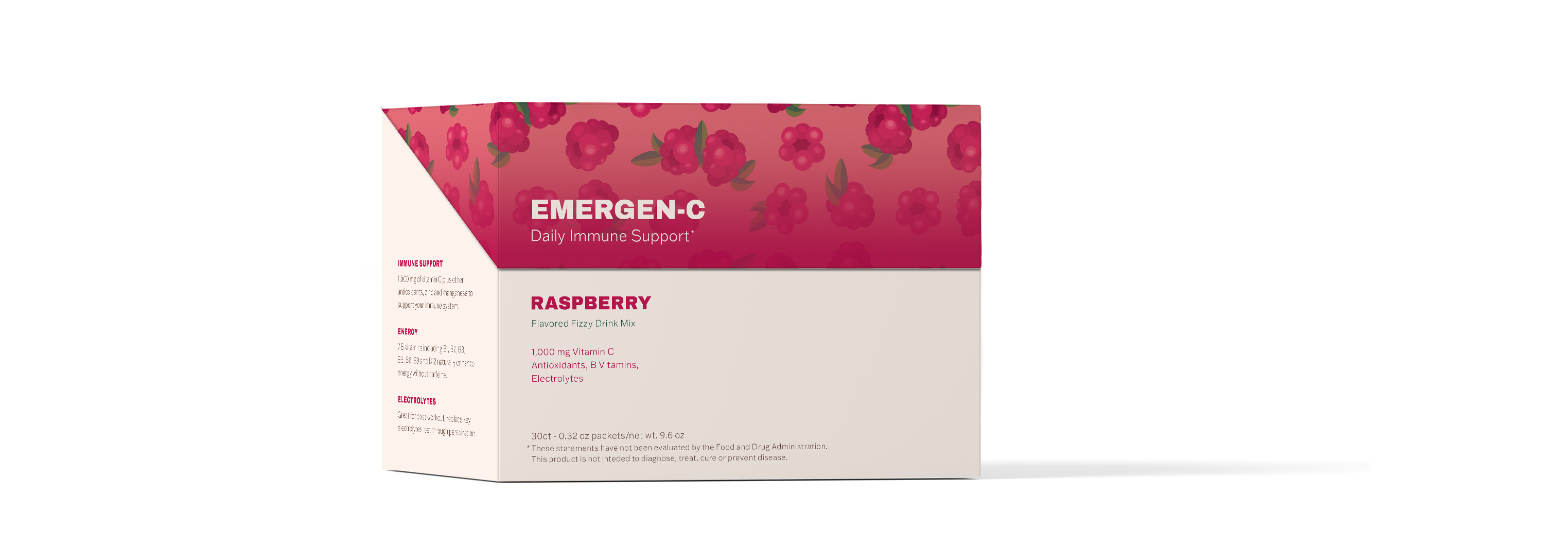
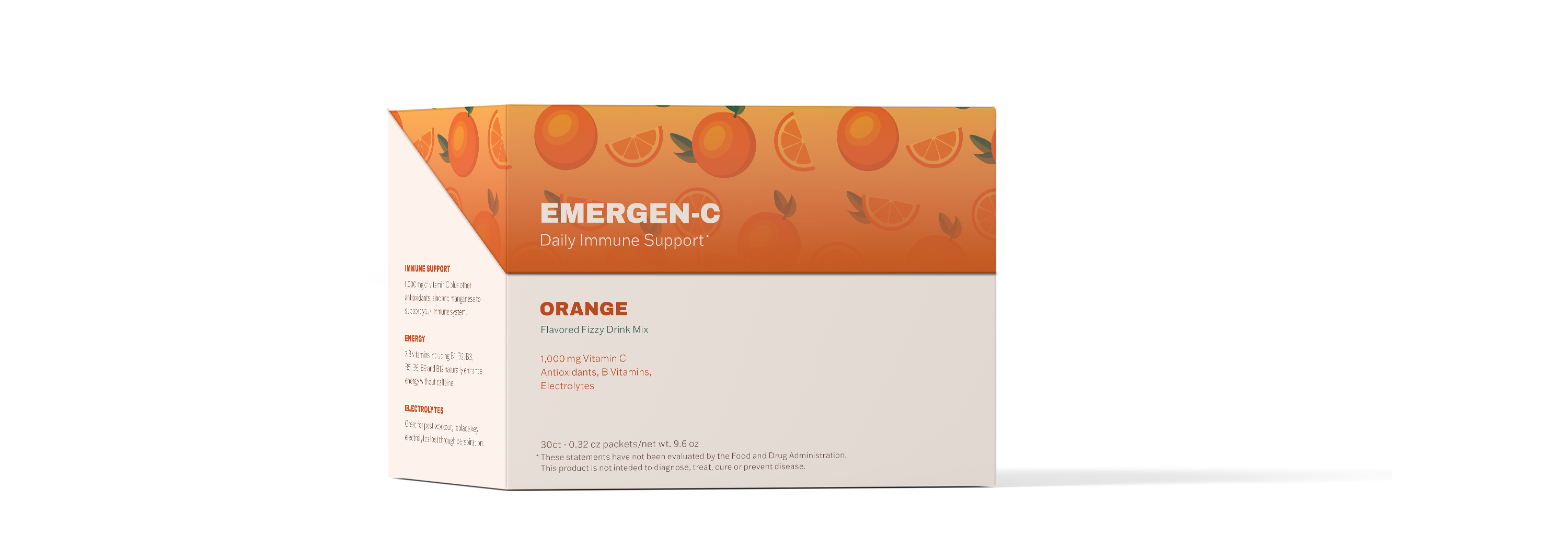
As an exercise, I was tasked with redesigning the packaging of a product I found to have poor design. I chose Emergen-C. As I began the design process for this Vitamin-C product, my first step was to conduct thorough market research. Through this process, I discovered that supplements had emerged as a major competitor to Vitamin-C products. I also identified a growing trend among younger consumers, who were increasingly gravitating towards natural remedies as opposed to traditional medicine. Recognizing this opportunity, I set out to create a design that would speak directly to this younger demographic, with a modern and trendy packaging aesthetic that emphasized the natural ingredients used in the product.
what
Adobe Illustrator
Adobe Photoshop
when
2021
problem
Clarifying product purpose and reaching a younger audience
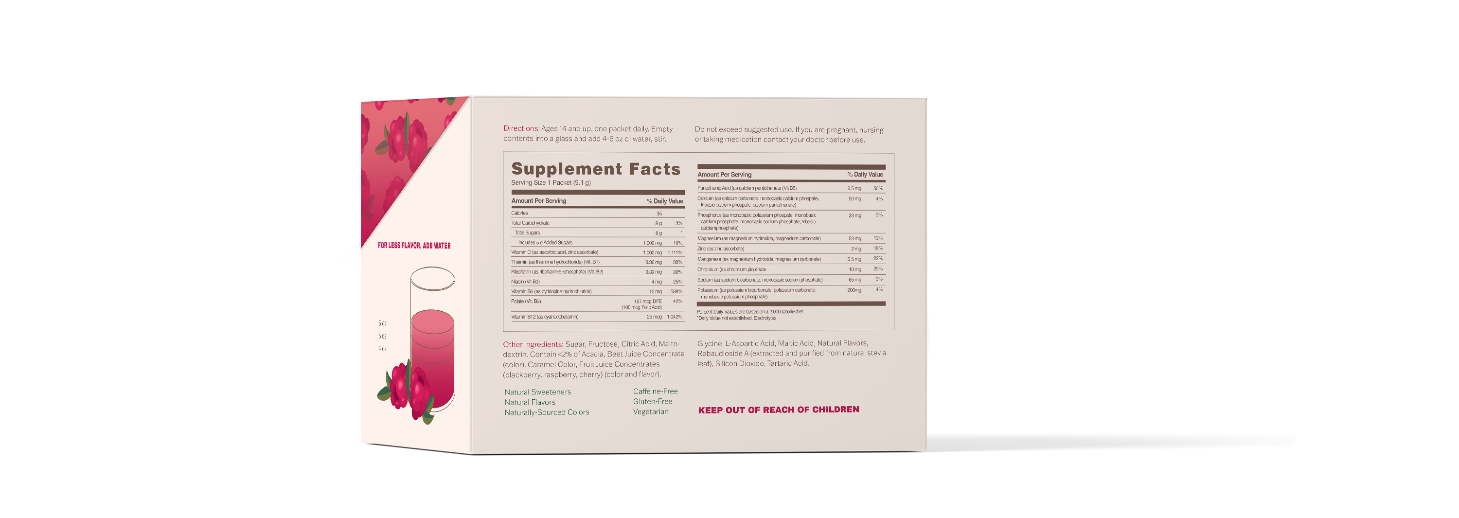
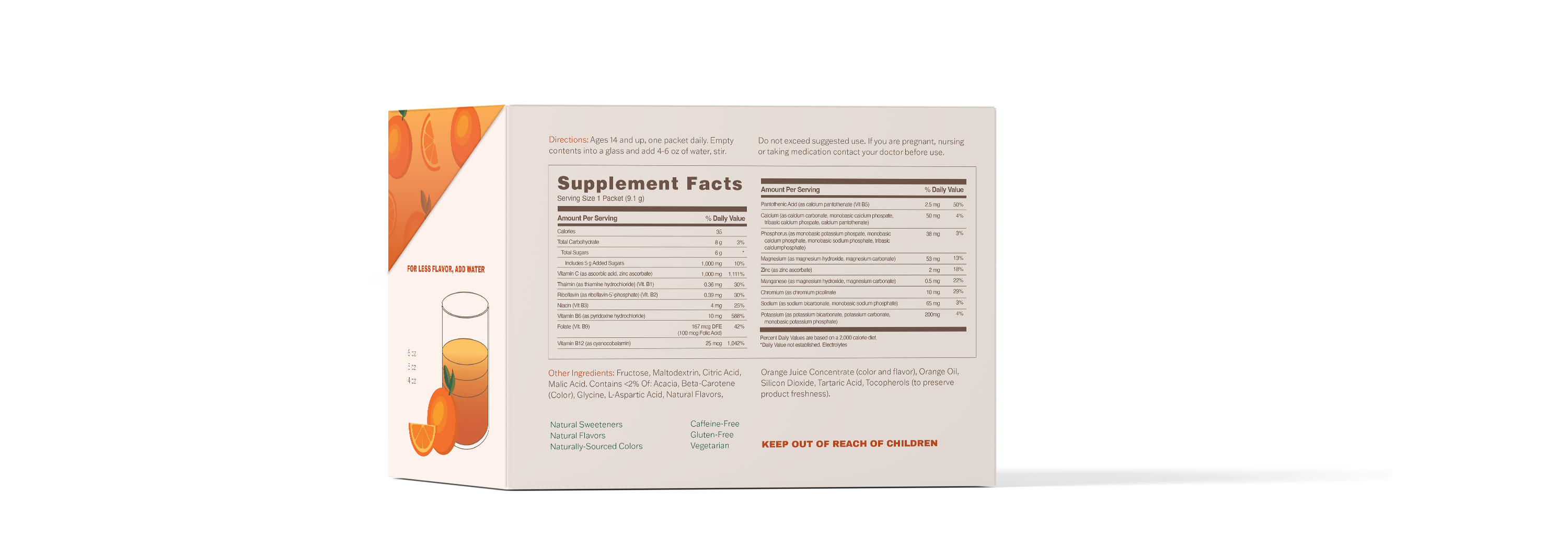
To achieve this goal, I employed a range of design techniques, including clear hierarchy, focused messaging, and a simplified layout that eliminated excess and unnecessary information. By emphasizing the key benefits and uses of the product, I was able to create a design that spoke directly to the needs and preferences of this target audience, while also setting the product apart from its competitors in the marketplace. Ultimately, I am proud to have created a design that not only looks great, but also effectively communicates the value and benefits of this unique and innovative product.
visual system
Setting the groundwork for a full line of products
I designed an adaptable visual system for a line of products to ensure that the brand remains consistent and recognizable across all touchpoints, while also allowing for flexibility and scalability as the product line expands and evolves over time. By developing a set of design elements that can be easily applied to a range of different products, from packaging to advertising to social media, I was able to create a cohesive and seamless brand experience that resonates with consumers and builds brand loyalty.


